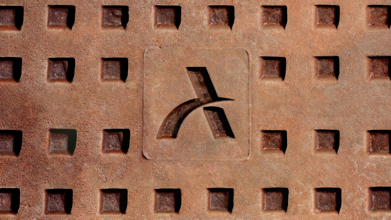
A mock rebranding for Ireland's The Museum of Print, designed as part of a rebranding course.
The brand identity is all about combining new and old, bringing together the famous printing press wheel with the modern, clean and timeless Neue Haas Grotesk (or: Helvetica) typeface, along with the brand colors that are somewhere between the three primary colors and CMYK. The design takes inspiration from the traditional printing press and wooden letter blocks.
The brand identity is all about combining new and old, bringing together the famous printing press wheel with the modern, clean and timeless Neue Haas Grotesk (or: Helvetica) typeface, along with the brand colors that are somewhere between the three primary colors and CMYK. The design takes inspiration from the traditional printing press and wooden letter blocks.


